TYPECAST: THE BLOOD TYPE BOARD GAME
Board game
Graphic Design
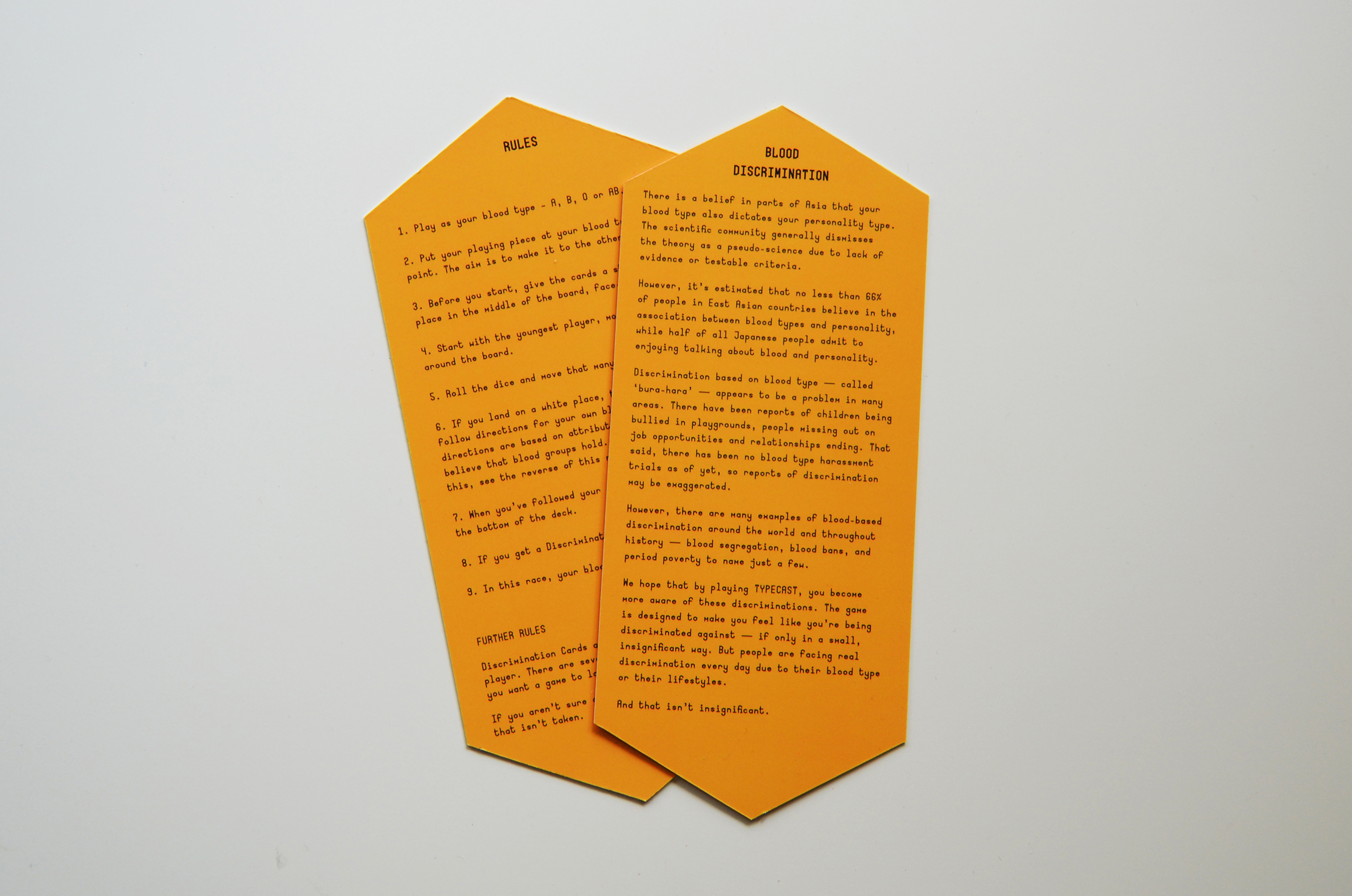
Blood discrimination of various types has always been a problem but there are few clearer examples than the instances of “bura-hara” – blood type discrimination – that takes places in East Asia. I set out to create an interactive piece of design, allowing the audience to experience a fraction of the unfairness that discrimination carries, a fraction of the frustration that comes with being told that you’re lesser based on an accident of birth.
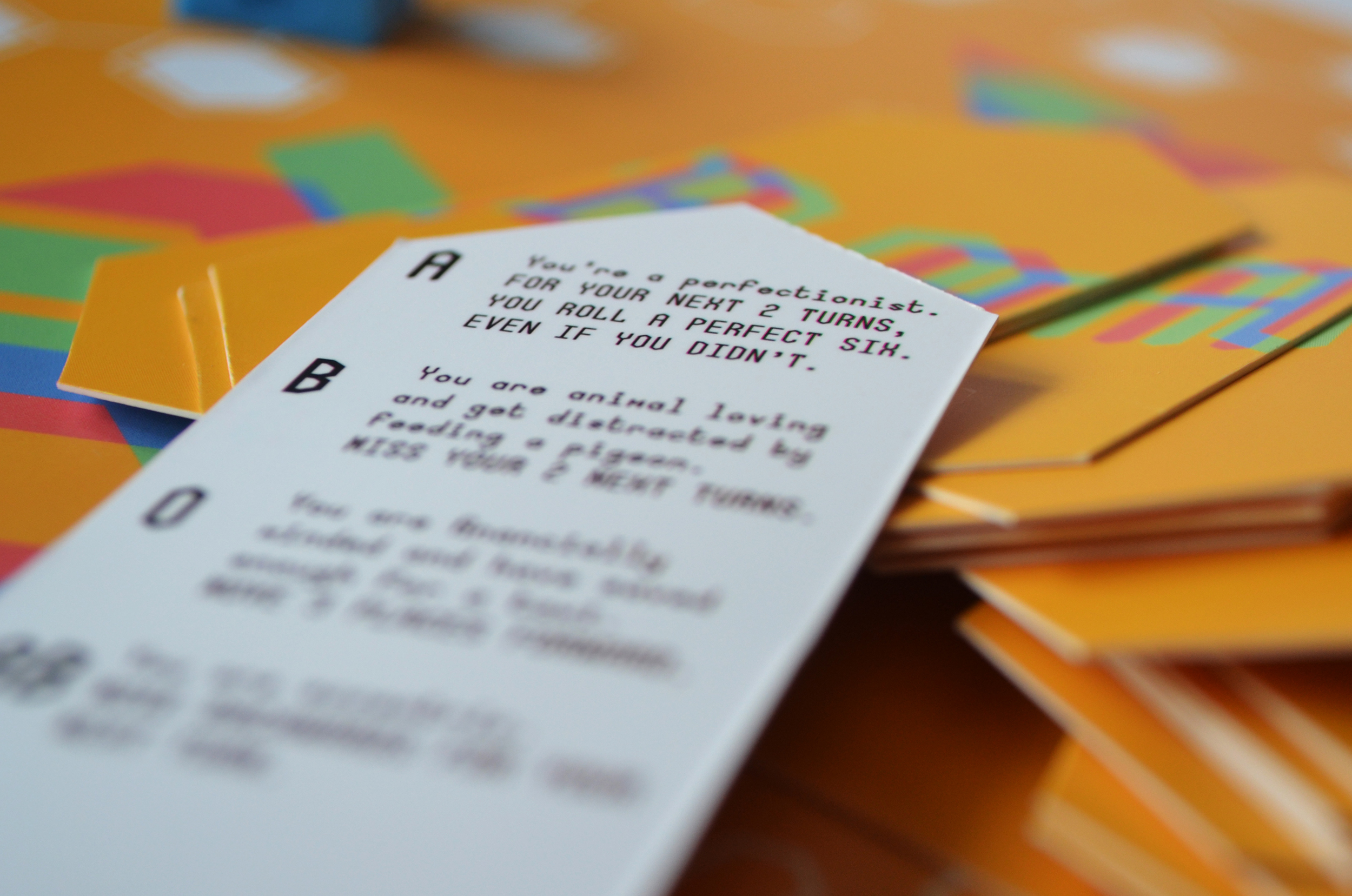
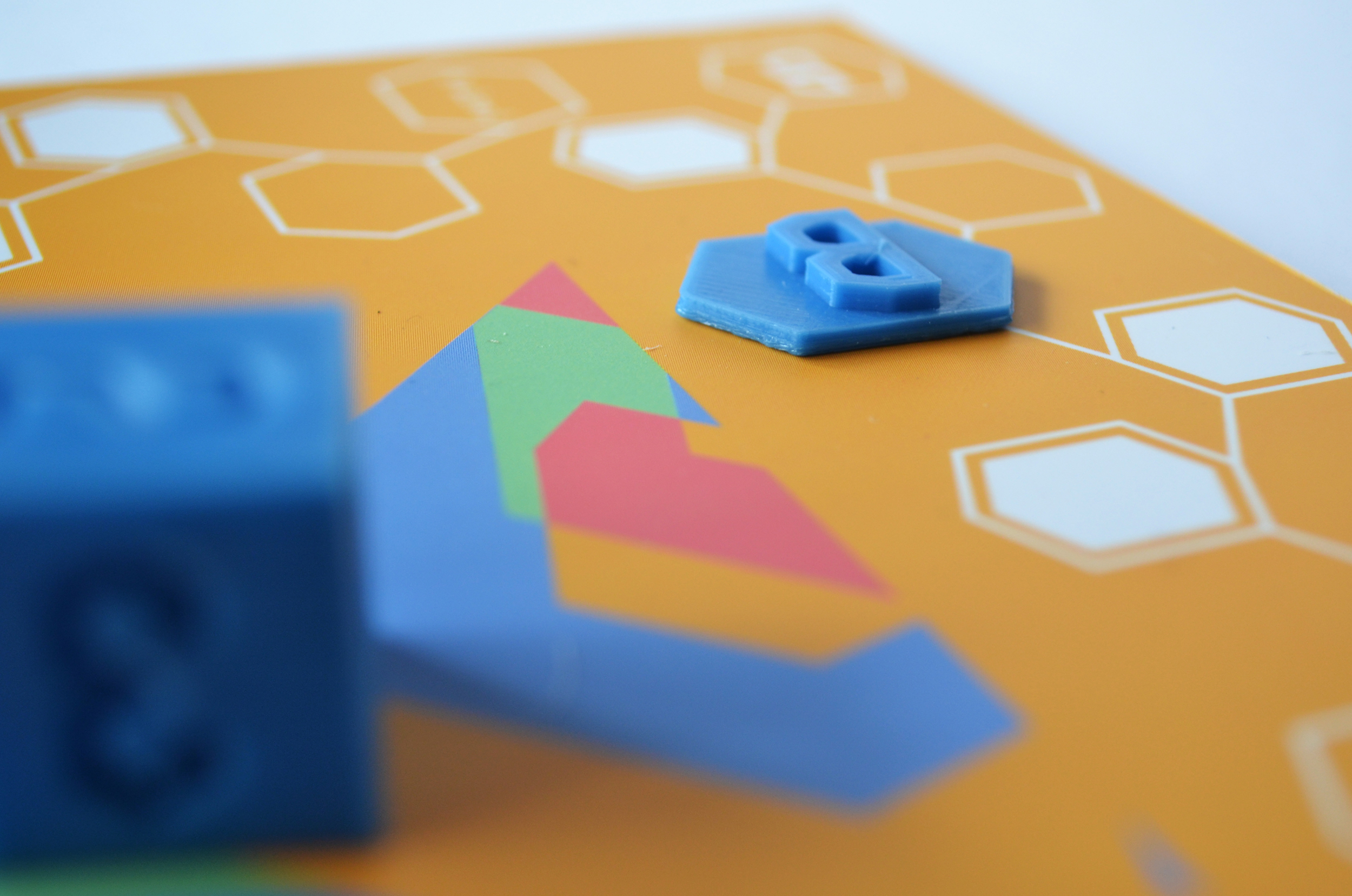
Once I had decided that I would design a boardgame, I worked out the rules. I wanted the game to be easy to pick up so a simple snakes-and-ladders type would work well. Each player would take a turn rolling a dice, with the aim to get their playing piece from one side of the board to the other. If they landed on marked squares, they would take a card, which would give them a rule based on their blood type. Some of the rules could have a positive personality attribute – and move them forward – while others would have negative ones that moved them backwards. I decided to make the negative cards harsher than the positive cards were kind, in order to frustrate the players further.
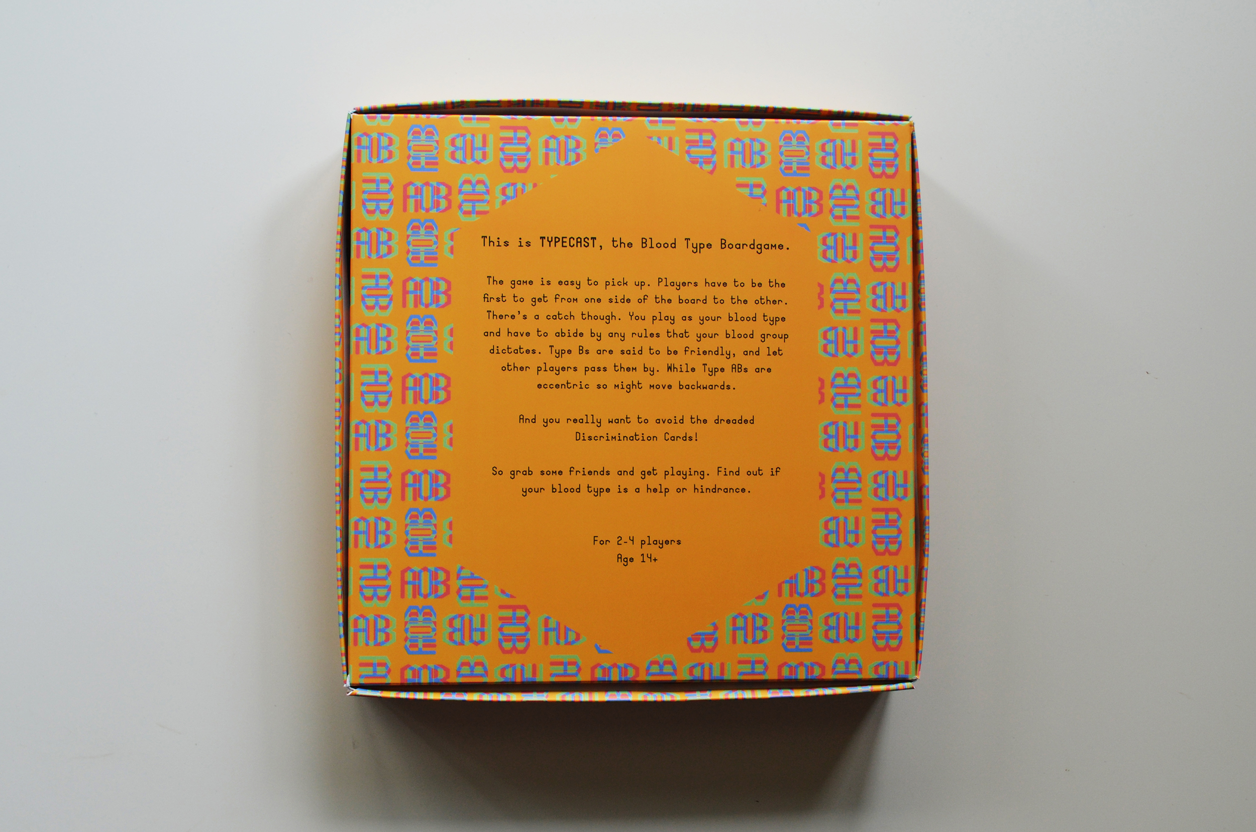
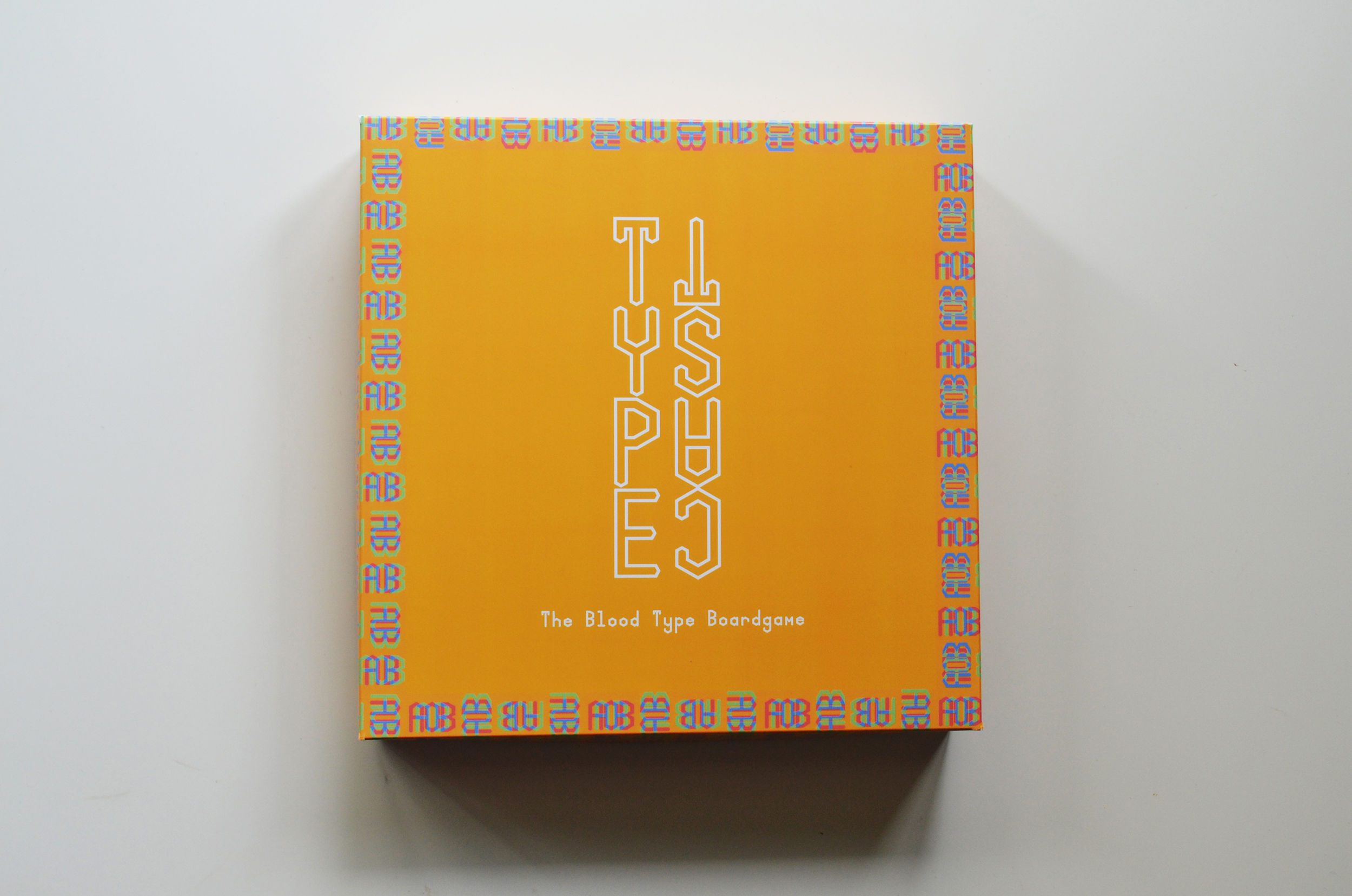
I pictured the box on a shelf in a toyshop, alongside rows of other games and knew that I wanted this game – which I decided to call Typecast – to catch the eye. So, while I did research boardgame designs, I did so to help me work out the layout of the board, rather than inspire the branding. As a whole, commercial boardgames tend to have lots of illustrations and smiling kids – an aesthetic I knew wouldn’t suit Typecast.
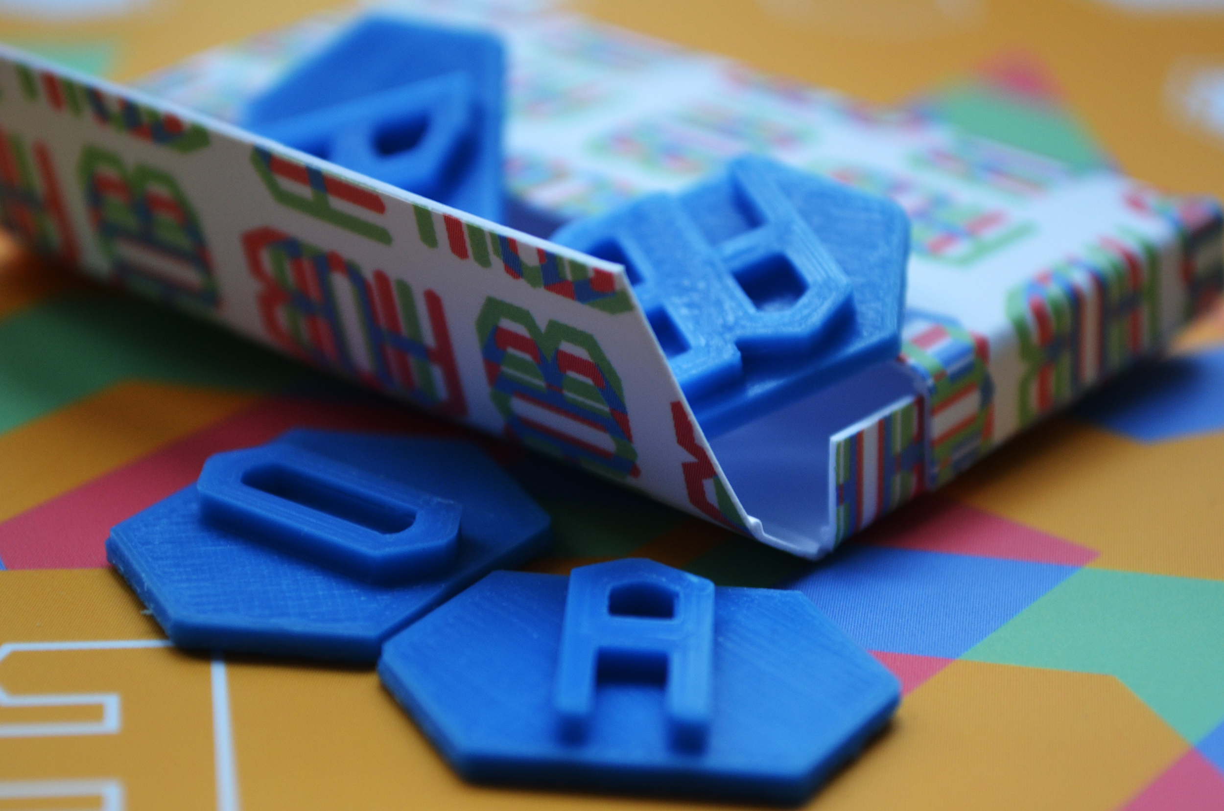
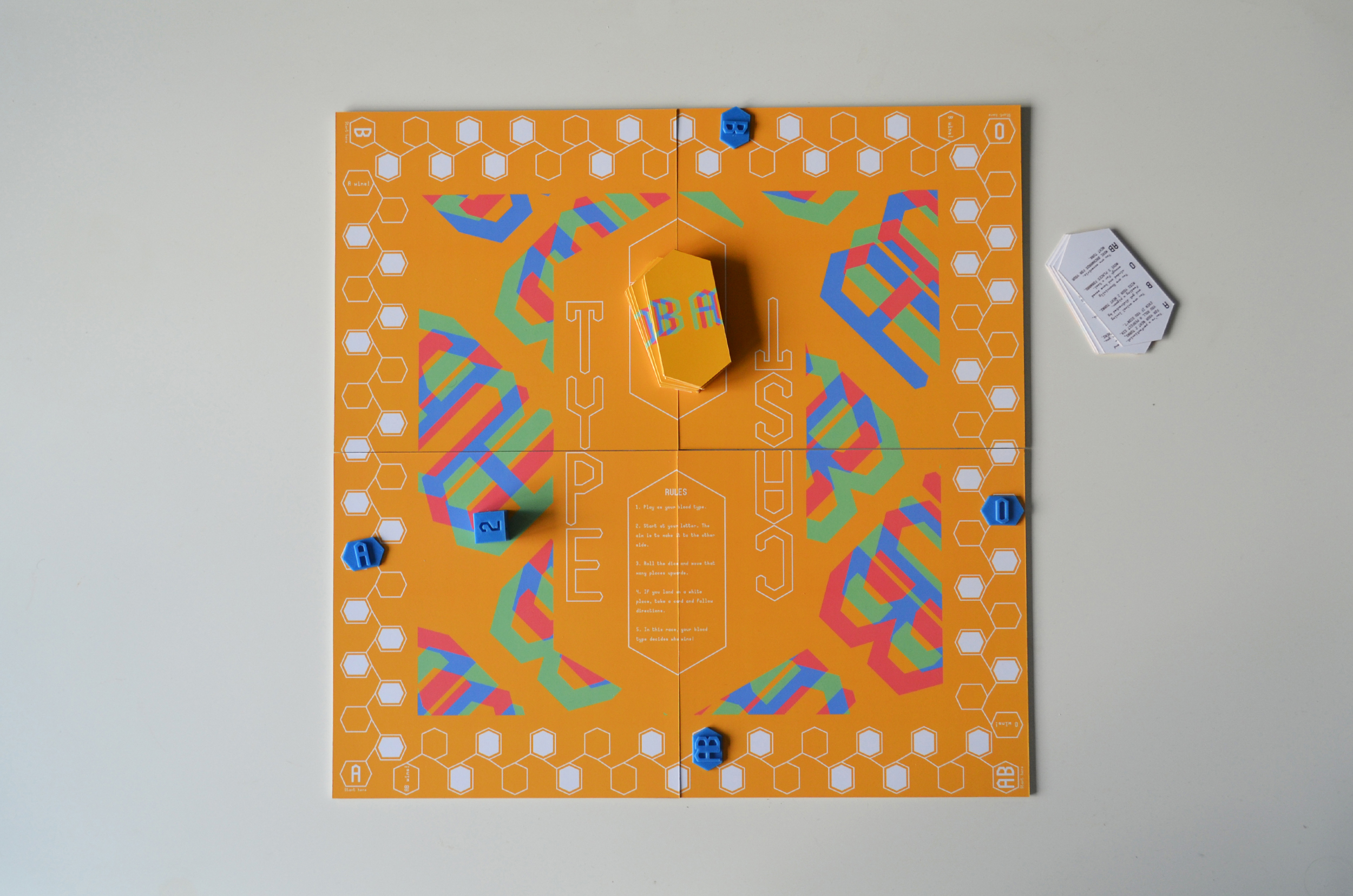
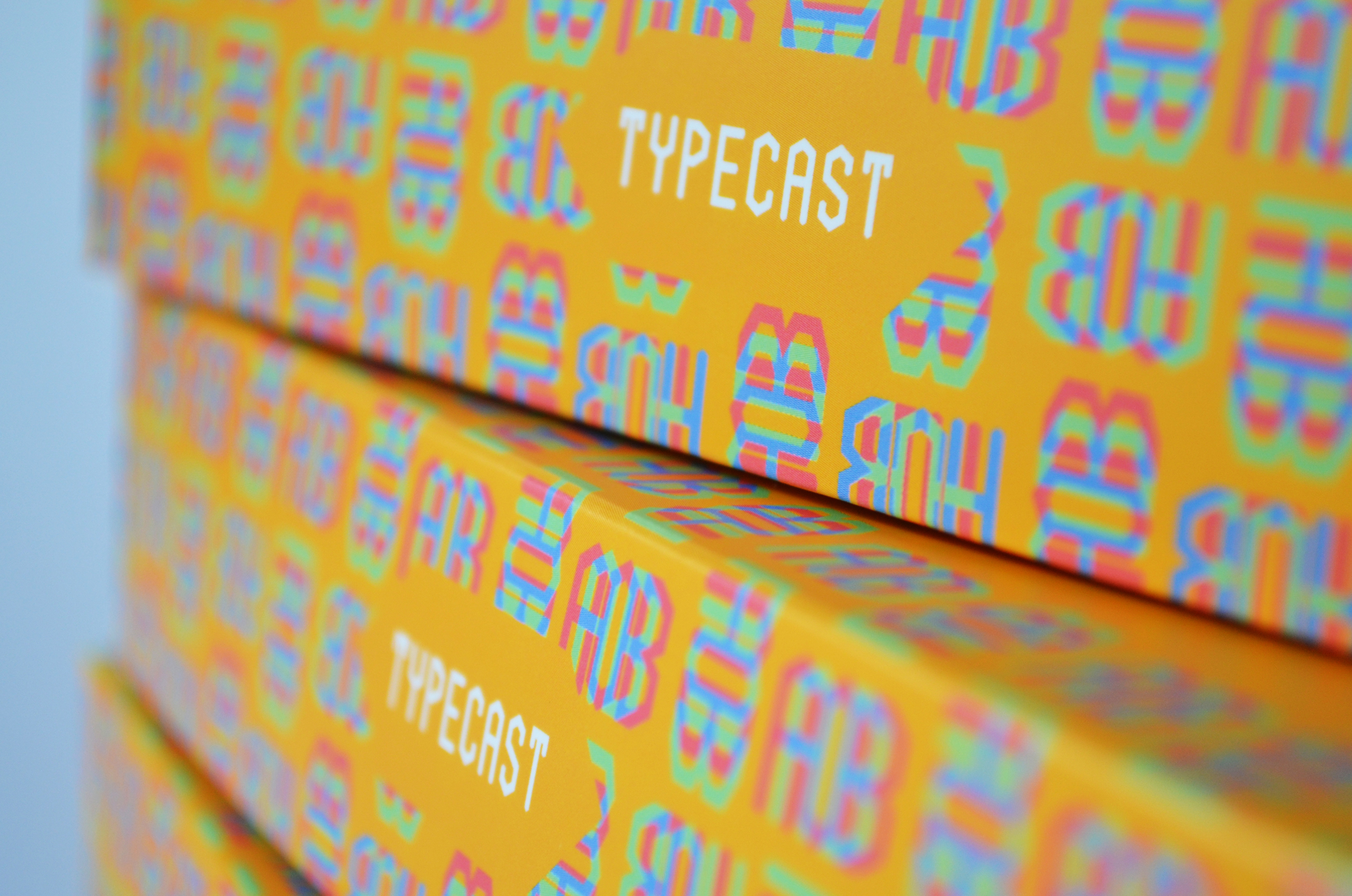
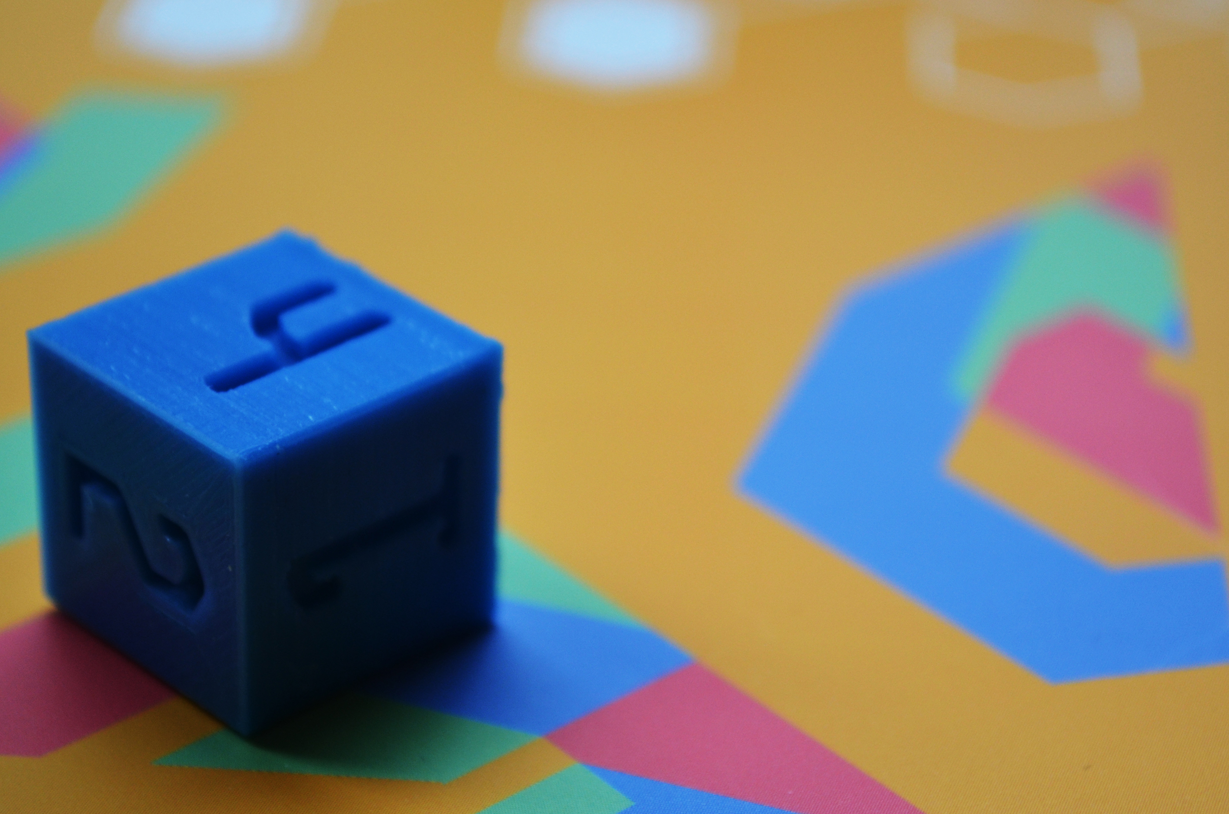
Since blood groups are categorised by letters, I came to the conclusion that type would play a large role in the visuals of the game. I also wanted to include a reference to the reality of blood and researched scientific images of blood; microscopic photography, diagrams and medical equipment. I was drawn to the diagrams that biologists use to illustrate the breakdown of blood types. Hexagons are incorporated to label the different elements. I felt that these hexagons would work well with type and started experimenting with these two elements.
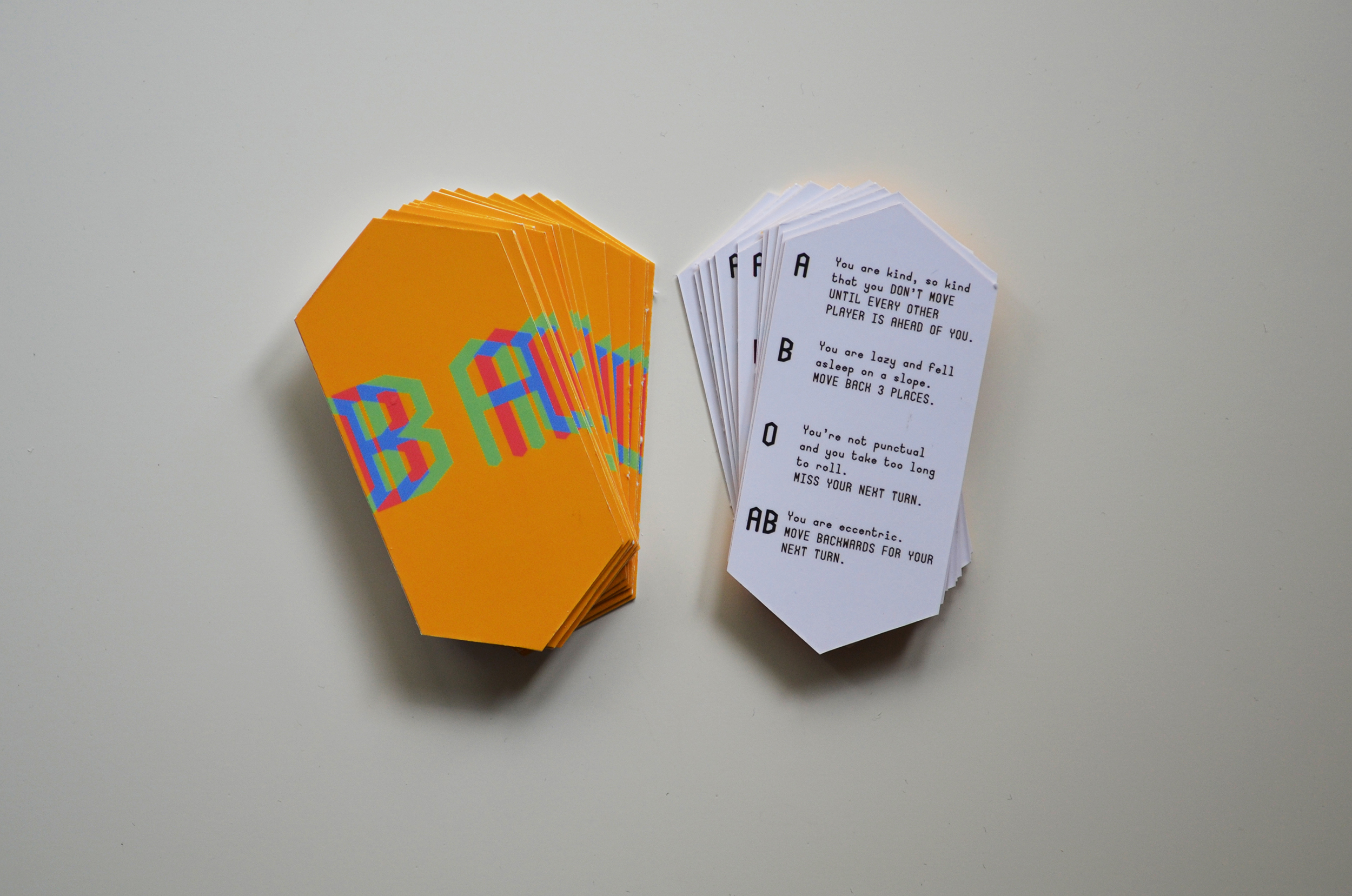
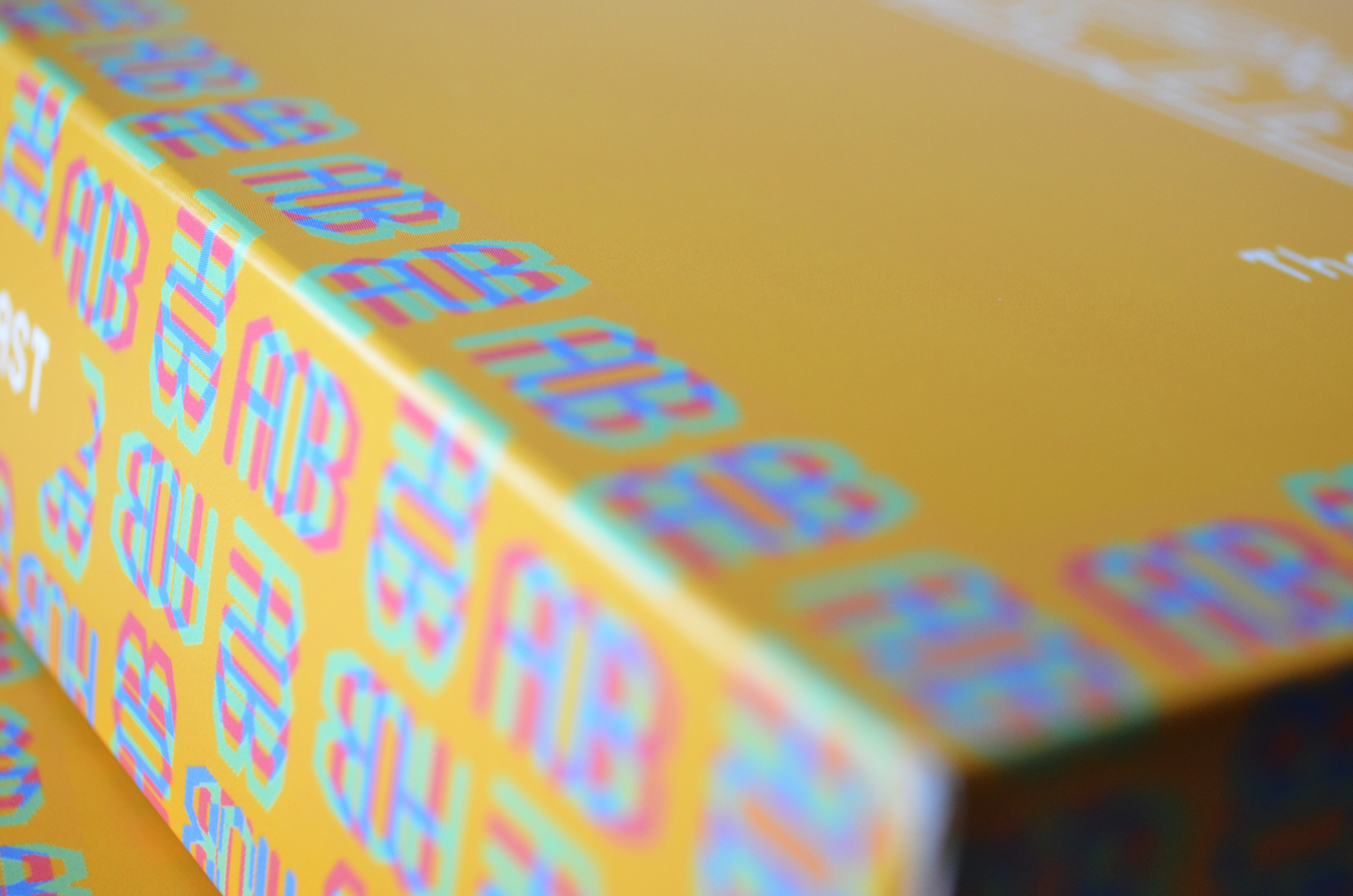
I designed a simple monogram of the letters A, B, AB and O, interesting the lines with the difference blending mode. I wanted the forms to be readable as letters on inspection, while also remaining as ambiguous shapes at first glance; a subtle reminder that we are all individual, yet complex and vague. The colour scheme I chose consisted of four bright colours, each one representing one of the blood types. But I chose those specific colours because they are the colours that human blood can be. Red obviously represents blood itself, while the yellow stands for plasma. The blue is a reference to the colour our blood looks in veins under skin, while green is the colour blood turns for anyone who has Sulfhemoglobinemia, a blood disorder. I didn’t go for the exact shade of plasma yellow or red blood since the true colours would create a sickly effect and, above all, I wanted the game to appear friendly and welcoming.
The playing pieces and dice were all 3D printed, encorporating the same hexagonal design used throughout.